There are thousands of examples of business-to-business (B2B) website design all around us. But what makes a really effective B2B website design?
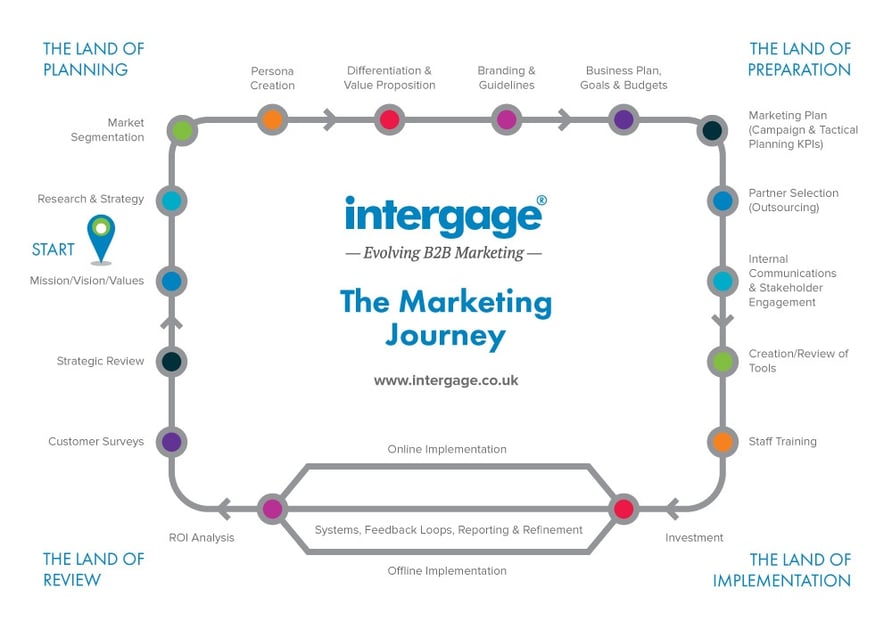
We believe that, before you approach website design at all, you need to get all your marketing ducks in a row.To make that easy we’ve devised the marketing journey. It looks a little bit like the Circle line on the London Underground. That’s no surprise as it is a circular journey which you can revise and review on an annual basis.

Getting started
Starting over on the left-hand side, it all begins with your mission, vision and values. What is your organisation, what is it all about?
Then following round, what research have you done into your market – what is your business strategy? Then have you segmented your market – what are those segments and how do they map against your products and services?
Have you created rich personas for all the people involved in the buying decision for your products and services? How do you then differentiate yourself from your competition – what is the value proposition of your organisation? And so on.
You can see from the Marketing Journey that there are nine more stops before you reach the 'Land of Implementation' – the point where you make an investment. We recommend working through these before you start your website design.
One of the most important aspects of designing a successful B2B website will be to understand your audience. This you will have from your segmented market and the rich personas that you have developed for each of your decision makers and influencers.
The other things which are important to get right are:
- professional imagery
- a quality user experience
- building credibility.
1) Professional Imagery
As an agency focusing on B2B customers, we’ve designed hundreds of websites.
Sometimes clients want to save money on images by using stock imagery but that’s often a false economy as there is seldom any good imagery out there that makes them stand out in the market place.
In fact, stock imagery is often used by several websites in the same sector, which dilutes their marketing into another ‘me too’ brand. Where possible, we would recommend getting a professional photographer to take unique pictures.
2) A Quality User Experience
More and more, people are using mobile devices to access B2B websites - have you checked your analytics recently? So any design needs to cater for this.
A responsive design should be built in ‘from the ground up’, which means that we are considering how the content will be viewed on tablets and mobiles right from the very start of the design project.
3) Building Credibility
Show your potential customers who you are. As a professional B2B organisation, you are not going to hide your contact details.
Why not highlight the directors and build up team bios so that your customers (and potential customers) can see who they are dealing with?
Case studies are the most obvious way to build your credibility – show them who you have helped, how you have helped them and what they said about you.
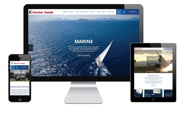
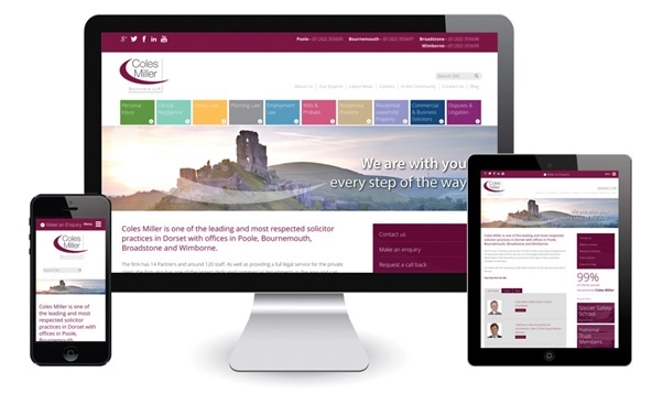
If you do the right preparation on the stops around the marketing journey and consider those tactics above, you will be well on the way to designing beautiful B2B websites like these:
Fischer Panda Marine Generators - http://www.fischerpanda.co.uk/

Coles Miller Solicitors - http://www.coles-miller.co.uk/

ASQ Projects: http://www.asqprojects.com/


